12.28.2010
12.03.2010
Final A/VOID
Final artifacts (poster (yellow), bus stop/placard (purple), motion piece(green)):
 Keynote presentation
This project has been challenging yet fun at the same time. At the beginning, we circled around ideas a lot and it took a long time to just even nail one down. Once we decided to go with the avoid idea, it was more formally challenging. We knew we wanted the split already but wasn't sure how to go about it. Then we added images and colors and different phrases. In the end, I'm satisfied with what we created. Making the presentation was a challenge of itself. It was challenging to know what to say on top of what to show at the same time. Overall, I learned so much from this project, especially how to work with a partner. I think my concept ideas are more strong now as well as formal executions. A lot of it was influenced by the partnership but it has also taught me a lot about how I think and work.

This project has been challenging yet fun at the same time. At the beginning, we circled around ideas a lot and it took a long time to just even nail one down. Once we decided to go with the avoid idea, it was more formally challenging. We knew we wanted the split already but wasn't sure how to go about it. Then we added images and colors and different phrases. In the end, I'm satisfied with what we created. Making the presentation was a challenge of itself. It was challenging to know what to say on top of what to show at the same time. Overall, I learned so much from this project, especially how to work with a partner. I think my concept ideas are more strong now as well as formal executions. A lot of it was influenced by the partnership but it has also taught me a lot about how I think and work.
12.02.2010
Presentation Readings
I do declare:
This was a good article to read. It listed bullet points and elaborated on them. Overall, presentation is all about confidence and keeping the audience engaged. The writer talks about how to do those things and how important it is that the audience keeps their interest. The person presenting should also know a few things like how to talk and what to present. What they say doesn't always have to be on screen and what they show doesn't always have to be said, but you also don't want to overlap people's voices in their head. Not quite the best advice out of the whole article, but I like how the writer told the presenter that they should "levitate".
Be Selfish:
This article supports the previous article a lot. In this one, it talks about knowing the audience. Our presentation should revolve around the audience and don't always assume they know what we know as designers. Hierarchy in what we show and what we say is also important. We also want to keep things simple in terms of the design of the presentation.
Communication Model
First round with analog and digital models:


 "Final" digital scheme:
 The idea is there, formally it's not though and that's what I needed to improve. So I redid it and now it is this:


Avoid Iterations
Since we decided what problem we were going to pursue, we came up with various tag lines and subtext. The top ideas were remember, avoid, think about it, and keep track. We showed all of these for crit along with some artifacts based on our channels.


The first one is a postcard and the second one is a storyboard for a motion piece. Joseph did a several versions of a poster for our other 2 ideas. We ended up going with the "avoid" idea because it could be read as "a void" or "avoid" and I like that play on words. So from there we just made a ton of iterations on how this could work on a poster first since if we figured that out, it could be applied to all the other channels. Our final channels are bus stop/placard inside the bus, a poster, and a motion piece. We also have 3 messages so each one is applied to each channel. For the message, we stated a fact and then provided a solution. We also made a number/website for people to contact if they wanted more information that isn't real. Joseph has a ton of iterations on his computer and maybe he'll upload those.


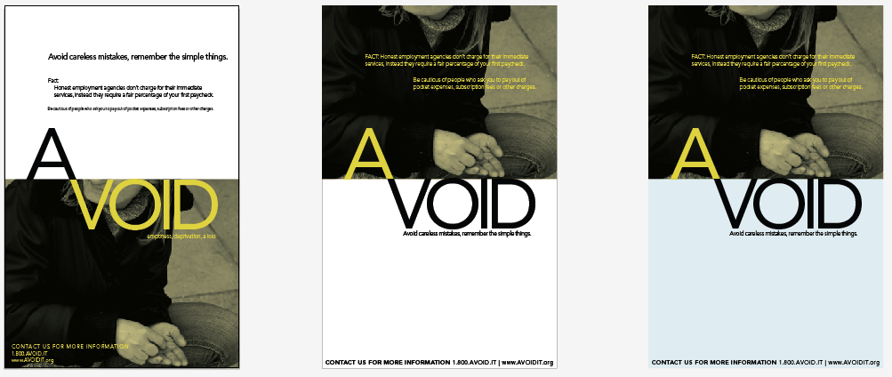


We ended up basing everything on the yellow and black versions (the bottom ones) and made the bus and the motion piece. We also changed the color and image based on the message. There was a lot more writing down on paper and ideas swirling in our head than there is physical artifacts so I didn't post them but instead did a lot of paraphrasing.
Poverty Intervention
This project stemmed from a simulation that our class was involved in that made us experience the life of an impoverished person. We were assigned to create a design intervention to solve problems that we saw at the simulation with a partner and mine was Joseph. The first 3 we came up was presented in a Keynote presentation. We wanted to address the upper class and make them aware. Our base schematic for this:


Those ideas didn't go over so well so we started from scratch again. This time, we made our audience the impoverished people and came up with many more ideas. One was to create something that people can carry around that would list all the places and the services they provided. That idea was already taken by another group so we didn't pursue it. Another idea was to create a community garden and a system that let the people interact with one another. They would plant whatever they want and take whatever they want. That turned out too be too complexed to do in several weeks so we dropped that idea. Another one we had was to create a system that allowed people to be part of this community that opened up their houses at night for people who got kicked out that night and it was too late to go to the homeless shelter. There is something like that already so we dropped that one. After all of these ideas, we finally landed on making an awareness campaign that reminded people to not get ripped off. I like that we kind of went full circle since we started with awareness and ended with awareness, just this time its another audience with another message.
11.30.2010
Final Motion Model
.swf of my model.
Below are screenshots of the .swf. The first is what it looks like originally. The second is when you hover over the text. All of them changes color besides the context/environment one, that just shows the text when you hover over it. The third one is when you click on that button, the text shows up in the middle.


I think with the interactive piece, I have more space to put definition of things so that it would be clearer to the viewer. In my still image, there was just one word or short sentences, and with the action scripting, there was a greater chance to write sentences that better convey the message. I also put sound as my noise and that's something print can't do. I wanted to put some images it but it would've made the information repetitive and it would make the diagram look more busy so I didn't. I also think that with the interactivity, the viewer can look wherever first and control where they are looking, so there isn't an overload of information to take in.
11.22.2010
Motion Communication Model
For the last project, we are animating our communication model that we made for Visual Language.


Originally, I wanted to have it zoomed into one word, like input, and then have the viewer click it and that would show the text underneath it. I would have the hover color another color so the viewer know to click it. From there, the lines would be drawn and it was stop at the next word and another click will show the additional information and so forth. Noise would also be able to click and that would sound and the viewer can click it on or off.
After the action scripting demo last Wednesday, some parts of my ideas are limited but I still want to try to get it to work. I can't figure out how to make it be in motion and then have an action and then it moves again. So since then, I've made storyboards for 3 different ways each message could show up.

I focused more on one part of the whole scheme because that's what I originally wanted, but it could be applied if my screen was the whole schematic. The first idea is basically the viewer seeing the line being drawn and they click on the square by the word and that would expand and have the text and supporting images/videos. The second idea is to have text pop down and within the text, the viewer can click certain words that would bring up imagery. The third one is to just have the word pop up when clicked and have it stay there while the viewer moves on. Since I was thinking to make the whole scheme moving, I didn't really bother thinking if the screens would come off or not. If I do make the scheme the whole picture, I would have to take them off but if not, it might just stay there.
11.10.2010
Final Ads
These are my final ads for this project. The first is the small version and then the big version is underneath it.
AfH Ad from Vi Pham on Vimeo.
AfH Ad 2 from Vi Pham on Vimeo.
You can see what I did since it is pretty straight forward. The big one aimed to convey the message of what the group is about while the smaller one aimed at getting people involved. This was the first time I made anything in After Effects so it was a good learning experience on how to create things in AE. It is A LOT easier than Flash, which I built my logo build in. I didn't change anything on that one so you can look at several post back for the final of it. After Effects was a bit tricky to do at first but watching tutorials while I did my piece helped. I also wanted to get away from being so text reliant since my past pieces were heavy on text. So it was hard coming up with images and ideas on how to make them interesting and now just boring but at the same time let them have a story/plot. Especially with the big ad, I wanted the footage to at least relate to the text and not have a disconnect. I didn't want to use sound because it is on a website and maybe I'll go back and ad sound once I learn how to encode it. It was also kind of hard timing the lines in the small ad because I wanted to keep these short at 10 seconds and the logo build is already 5 seconds so I only had 5 seconds to work with. I semi cheated with that one and made the logo build a bit shorter so that there was more time for the imagery and the text to show up. I timed the text on both to be short enough to fit but also long enough so that people have time to read it. In general I had fun with this project. I learned a lot more of AE and using imagery was a challenge for me.
Ad Storyboards
Storyboards for my ads. The first one is like 300x100 pixels? I wanted to go with a drawing idea and how it creates a home and then the logo at the end. I couldn't scan this in one piece so sorry, you'll have to piece it together, but you get the idea.


For my second one, it's a bit bigger. I was going to have the earth appear and then maybe rotate while having different background colors and then the logo appearing. Also split and cut off too, so sorry.


Those were my initial storyboards. Since then, I kinda progressed away from it and went with other ideas that you'll see in the final pieces.
11.03.2010
AfH Ads Brainstorm
For the second part of the project, I had several ideas going. The first one I thought of was an opening for the website, so it would be a little film/animation that would play before people would enter the site. Within this opening, I wanted to use imagery as the main focus since I've relied on text a lot for the past projects. I was maybe going to incorporate live action somehow and it would be about the organization along with current projects that they are doing.
From that idea, I thought about making a series of ads that would appear on other websites, like AIA and Buildipedia, which are other architectural websites. This stemmed from wanting to get the word out there about Architecture for Humanity. This is kind of like the opening idea except now I'm limited to a space and probably like a 10 second animation. It would use images and color with minimal text and end with my logo build. This is the idea that I'm going forward with and I'm making two that focuses on different aspects of the group to get people to join them. One talks about what the group is about and I'm using stats for that, like how many chapters there are and how many people are a part of it. The second one is more like a call for designers to submit ideas and help build communities in places that need help.
Other ideas that I had was to make a scrolling, loop thing that would sit on top of the website and it would be like the ads, except it will be on the website itself. It would contain the basic information in one small loop and other loops would be like current projects and events. Every time the page refreshes or the audience goes to another page, the top animation would be different. I also thought about making a non-digital piece like a brochure that would inform people and get them to join the organization. Yeah. I'm going with the ad idea, like I said before and hopefully it will work.
Final Logo Build?
Final? from Vi Pham on Vimeo.
This is my "final" logo build. I'm not sure if it will change from now and final crit or not but that's what it is right now. I learned a lot about timing and how each picture, when it flashes, should relate to the actual logo somehow, like when it hits the corner and begins drawing a new line. It was also kind of dull at the beginning of building this so I tried making it more interesting in terms of text and the images I chose. Originally, I had a lot more images but decided to take out a few so that it aligned better with the logo and it didn't feel rushed or choppy. Perhaps it will change before I have to turn it in, we shall see.
Logo Build Rounds
Since the storyboards, I've made several versions of the logo build. I decided to go with the logo drawing itself out to play off of the idea of "designing" and drawing. I ended up putting the images inside of the logo in the triangular part because I didn't want it to be outside of the logo. I played around with timing and how the text enters to make it more interesting.
I also tried building the logo differently but I didn't like it as much.
These rounds helped me picture how the text should enter. By doing several iterations, I was able to see what was working and what wasn't and taking that to the end product.
10.31.2010
Communication Models
In all the assigned readings and video, the message is pretty much the same. There are multiple communication models that includes the source, message, channel, and receiver. In all three, they talk about the importance of each one. The source is where the message is coming from. It is the place that decides what information is going where. Then there is the message which is the message itself, the information that needs to be passed on. The channel is what the message travels through and in this channel, there might be noise that distorts the information. The receiver is the destination of the message. It is where the message is meant to reach. Through the whole process, information could be left out or new information could get included. In Berlo's model, he lists elements that will affect the course of the information like attitude, knowledge, and the channel the information is conveyed through. The thing that wasn't mentioned in all three was feedback from the receiver. The only reading that mentioned it was from the book where they talked about it in respect to the designer's world rather than everyday use of the model. Feedback is extremely important to know if the message you are conveying is clear or not. Another thing that is important when making a communication model is noise and how it affects the message. Noise can range from anything that affects the message's clarity. The best way to lower the noise is through redundancy, which is to show the message, or repeat it, multiple times to make sure the receiver understands it. In general, you want your message to be conveyed thoroughly so that everyone would be able to understand it as well as get feedback on it so that you can improve the parts that is weak in conveying the information.
10.28.2010
Tropicana Redesign
The first sentences or so made me smile because it reminds me of what happened when the Gap changed their logo several weeks ago and it got negative comments. The packaging design business is really reliant on the consumers and people don't like change. Since Tropicana had such a strong and memorable design, when it changed into something that wasn't as clever and looked plain, people wanted the old design back. I feel that is the same with the Gap because the original logo was a lot better than the one they put out weeks ago. It is also interesting how much input from the consumers is considered and how they are voicing their opinions. With technology these days, it's quick to get a response to your design and gather other ideas. Packaging design relies heavily on the people that buys it and if it doesn't appeal to the masses, it's not working.
Test
I'm going to use my sketches for these explanations.


Final Packaging
Before my final piece, I tried different coloring to the molecules and I used another color that wasn't very "honeycomb" like and I didn't feel like it worked as well so I kept with just oranges and yellows.


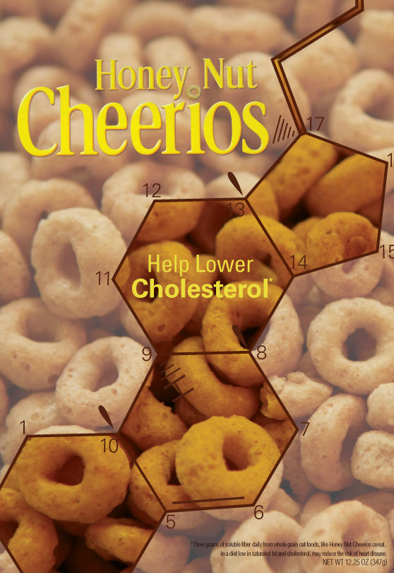
 The original package for Cheerios was ethos because of the big white check mark saying that it is whole grain guaranteed along with General Mills logo. So my modes are logos and pathos. For logos, I went with the "help lower your cholesterol" idea and using the molecule as a representation of that. It also has the honeycomb shape, which reiterates that it's Honey Nut Cheerios. I kept with a structured layout and centered my type to make it have more authority and look like it knows what it is talking about. For pathos, I went with a happy theme and the idea that Cheerios is like the sun. You should wake up with the sun and be happy. I drew out all the elements to replicate a child's drawing and therefore hopefully attract kids. I also used a photo of the Cheerios instead of drawing it so that people could recognize that it was a Cheerio and not a drawing of a circle. I tried to keep it fun and light and happy.
I feel like both of my packages have certain audiences. Like logos is directed towards adult more than it is directed towards kids and pathos is more for kids than adults. I find that interesting that it just kind of happened and it makes me wonder if I could have done logos and still appeal to children. I probably could by just the way it is executed. In the end, I'm happy with what I did. I think some parts could be more interesting but once I put it in a context shot, I really like them.

So here are the final designs:


And then the stuff for the presentation critique.


I feel like both of my packages have certain audiences. Like logos is directed towards adult more than it is directed towards kids and pathos is more for kids than adults. I find that interesting that it just kind of happened and it makes me wonder if I could have done logos and still appeal to children. I probably could by just the way it is executed. In the end, I'm happy with what I did. I think some parts could be more interesting but once I put it in a context shot, I really like them.
Repackaging Rounds
More iterations of the two concepts I continued on with. First, will be my logos. So here are round 1 iterations:


From this round, the middle bottom works the best because of the transparency and the image as background. I kept with that one and continued on with another round. This time, I focused on making the molecule less scientific and more artistic since I had the structure down already.


These are more subtle changes but there are bits and pieces that I pulled from each for the final. The weight change in the molecule looked a lot better than when it was one weight or when it was bubble looking. The details in the molecule looked best with the circles so I took that and applied it to all the detail lines. The font for the numbers weren't working yet so I changed it for the final. Next are my pathos with the swinging girl. While I was working on that, I wasn't really loving it so I reverted back to the Cheerio as the sun since people were talking about it in class so I thought I could at least try it.


I tried the drawing techniques with multiple drawing tools and mixing them here and there. It was decided that I went with the sun concept and honestly, I like it a lot better than the swing. There wasn't much to change in terms of elements, it was just rearranging them here and there. So that's mainly what I did in the last round.


The very last one has a very light blue tint to it but it looked better in just white. So that's that.
Subscribe to:
Posts (Atom)