10.31.2010
Communication Models
In all the assigned readings and video, the message is pretty much the same. There are multiple communication models that includes the source, message, channel, and receiver. In all three, they talk about the importance of each one. The source is where the message is coming from. It is the place that decides what information is going where. Then there is the message which is the message itself, the information that needs to be passed on. The channel is what the message travels through and in this channel, there might be noise that distorts the information. The receiver is the destination of the message. It is where the message is meant to reach. Through the whole process, information could be left out or new information could get included. In Berlo's model, he lists elements that will affect the course of the information like attitude, knowledge, and the channel the information is conveyed through. The thing that wasn't mentioned in all three was feedback from the receiver. The only reading that mentioned it was from the book where they talked about it in respect to the designer's world rather than everyday use of the model. Feedback is extremely important to know if the message you are conveying is clear or not. Another thing that is important when making a communication model is noise and how it affects the message. Noise can range from anything that affects the message's clarity. The best way to lower the noise is through redundancy, which is to show the message, or repeat it, multiple times to make sure the receiver understands it. In general, you want your message to be conveyed thoroughly so that everyone would be able to understand it as well as get feedback on it so that you can improve the parts that is weak in conveying the information.
10.28.2010
Tropicana Redesign
The first sentences or so made me smile because it reminds me of what happened when the Gap changed their logo several weeks ago and it got negative comments. The packaging design business is really reliant on the consumers and people don't like change. Since Tropicana had such a strong and memorable design, when it changed into something that wasn't as clever and looked plain, people wanted the old design back. I feel that is the same with the Gap because the original logo was a lot better than the one they put out weeks ago. It is also interesting how much input from the consumers is considered and how they are voicing their opinions. With technology these days, it's quick to get a response to your design and gather other ideas. Packaging design relies heavily on the people that buys it and if it doesn't appeal to the masses, it's not working.
Test
I'm going to use my sketches for these explanations.
Logos is using facts to appeal to the mass. My Dove chocolate sketches use several facts of chocolate itself and how helpful it is to the brain and so forth. I also listed nutrition facts and making it all about the facts and different ways to present it.
Pathos is appeal to people's emotions and experiences so it differs for every viewer. With Cheerios, I went into the happy and joyful route with the idea that it makes people happy. It also seems like its geared towards kids more than it would to adults just because the nature of cereal and its association with kids.
Final Packaging
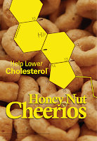
Before my final piece, I tried different coloring to the molecules and I used another color that wasn't very "honeycomb" like and I didn't feel like it worked as well so I kept with just oranges and yellows.
I feel like both of my packages have certain audiences. Like logos is directed towards adult more than it is directed towards kids and pathos is more for kids than adults. I find that interesting that it just kind of happened and it makes me wonder if I could have done logos and still appeal to children. I probably could by just the way it is executed. In the end, I'm happy with what I did. I think some parts could be more interesting but once I put it in a context shot, I really like them.
So here are the final designs:
And then the stuff for the presentation critique.
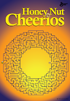
The original package for Cheerios was ethos because of the big white check mark saying that it is whole grain guaranteed along with General Mills logo. So my modes are logos and pathos. For logos, I went with the "help lower your cholesterol" idea and using the molecule as a representation of that. It also has the honeycomb shape, which reiterates that it's Honey Nut Cheerios. I kept with a structured layout and centered my type to make it have more authority and look like it knows what it is talking about. For pathos, I went with a happy theme and the idea that Cheerios is like the sun. You should wake up with the sun and be happy. I drew out all the elements to replicate a child's drawing and therefore hopefully attract kids. I also used a photo of the Cheerios instead of drawing it so that people could recognize that it was a Cheerio and not a drawing of a circle. I tried to keep it fun and light and happy.I feel like both of my packages have certain audiences. Like logos is directed towards adult more than it is directed towards kids and pathos is more for kids than adults. I find that interesting that it just kind of happened and it makes me wonder if I could have done logos and still appeal to children. I probably could by just the way it is executed. In the end, I'm happy with what I did. I think some parts could be more interesting but once I put it in a context shot, I really like them.
Repackaging Rounds
More iterations of the two concepts I continued on with. First, will be my logos. So here are round 1 iterations:
From this round, the middle bottom works the best because of the transparency and the image as background. I kept with that one and continued on with another round. This time, I focused on making the molecule less scientific and more artistic since I had the structure down already.
These are more subtle changes but there are bits and pieces that I pulled from each for the final. The weight change in the molecule looked a lot better than when it was one weight or when it was bubble looking. The details in the molecule looked best with the circles so I took that and applied it to all the detail lines. The font for the numbers weren't working yet so I changed it for the final. Next are my pathos with the swinging girl. While I was working on that, I wasn't really loving it so I reverted back to the Cheerio as the sun since people were talking about it in class so I thought I could at least try it.
I tried the drawing techniques with multiple drawing tools and mixing them here and there. It was decided that I went with the sun concept and honestly, I like it a lot better than the swing. There wasn't much to change in terms of elements, it was just rearranging them here and there. So that's mainly what I did in the last round.
The very last one has a very light blue tint to it but it looked better in just white. So that's that.
10.21.2010
Grid Rounds
For type now, we are making a book that will be about Pierre Koenig, who is this architecture person. The first thing we did was create a grid for our content. Round 1 which wasn't amazingly good:
So I took some elements of round 1 and put it into round 2. His stuff is really geometric with rarely any diagonals so I wanted to incorporate that. I put in diagonal lines that cut through the pictures because there are some diagonals in his architecture picture that is made by perspective of the rectangular elements crossing.For the fonts, it is Myriad and Minion. The body text is in Minion and everything else is Myriad. I feel behind on this project but at the same time, I feel like everyone else is on the same page. Now I just need to put my contents in which will change the grid around again.
Repackaging Sketches
Sketches I did for last Monday. I did 5 sketches for all of my ideas since I had 5 concepts for each category. So first are logos:
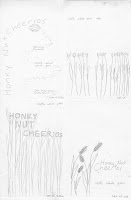
The last image, only the top left is logos, the other 3 is part of pathos. Below are the rest of Pathos:


There is a rendering method on the last picture but the rest are below. I accidentally scanned them in black and white but the idea is there. Mainly they are just mixing different ways. I like the hand-drawn things mixed with maybe a vector or a photograph. So for the actual digital ones, I'm mixing hand-drawn with photo and then photo with vector.
After the sketches, I digitized 3 concepts: the beehive shape thing, the molecular structure of cholesterol, and nutrition facts on the front. These are logos and I'm continuing with the cholesterol molecule.
The rest are pathos. Originally I also have the Cheerio as the sun but I felt like the following two were stronger conceptually so I did them instead. Perhaps I will go back to the sunshine one since formally, it could be more strong. For now those, for pathos I will be going with the Cheerio as a tire swing.
Subscribe to:
Posts (Atom)


