5.09.2011

Sculpture Story Final

Final Presentation


I enjoyed this project because it dealt with kids. It was also something different after doing projects based on our studied subcultures. At first I didn't really know where I was going with things, which made designing it harder. I had a strong concept but really weak execution, something that I still need to work on. In the end, I really like where it went. I learned that designing simple things is actually really hard and making it work is also hard. I'm also not strong at choosing colors and that's something I will explore more.

ctrl+alt ESCAPE Final

Final Presentation

In general, this was a fun project. I felt like I could've taken it further. During final crit, there were suggestions made that I will consider and apply for the presentation with Kathy. I learned that designing an app for a small screen can be challenging in terms of how the users uses it. There's so many rules in terms of what the users can click and size and finger motions and set rules Apple already has. It was interesting to try to work around all of that.

5.05.2011

"Sculpt Your Own Story" Progress

Concepts:


Round l:
I also had rendering drawings which were basically just line drawings of the sculpture.

Round 2:

 
This was what I showed the Nelson for a concept brief, which was more about concept than design.

Round 3:
This was what I showed for that in class testing day with our class.

Round 4:
What I showed for the testing day with kids. They had really great feedback like size how I should approach it more.

Round 5:


And then just a ton of iterations:


iPhone App Wireframes

Scenario 1, sharing own tip:

Scenario 2, setting alarm:

Scenario 3, viewing and saving tips:

Final, viewing tips:

iPhone App Progress

Round 1:

Flushed 1 design:

Round 2. Backtracked and went with more of nature feel:
Round 3:

 Round 4:
Itunes page rounds:

5.04.2011

Readings 05.06.11

Designing for Children: Designing for a younger audience is a lot harder than what people would think. The design should inform, delight, and satisfies. Producing a design that caters to a wide age range is also difficult because you want to keep the older kids engaged but you don't want to leave out the younger ones that hasn't fully understand complex ideas. The designs should not speak down to the kids or make them feel any smaller or younger than they are. I feel like my idea caters to all ages since it is so open-ended, the kids can answer the questions however they want.

Map design: When designing maps, there are 5 things to keep in mind: decide on concept before making, hierarchy of elements, simplicity until you can't take out anything else, must function well, and use emotion to design so that the emotion can be conveyed to the users. I feel like my map kept those all in mind but while I was making it, I did things more backwards than forwards. I didn't have a concept to start with and I kept it simple from the beginning and kept adding instead of keeping it complicated and taking away.

Play as Research: Iterative design is important when creating for audiences that will interact with the artifact, such as games. It allows you to see things you missed when you first design it. With our project, we had a user testing day and everyone benefitted from it. I saw what was wrong with my design and how to improve it. Testing it also made the project "real" and that it should cater to the audience the best way possible.

Type D

So for final crit, I printed out some Helvetica D's and passed them out. The rules were to make an assigned letter, using the least amount of cuts possible with the max being 7, and somewhere in the made letterform, have a gap between strokes. These are what I got back:


I also made my own set of alphabet with just the D and the same rules.


During final crit, I will also ask my fellow classmates to do the same. Therefore, I will have 3 different sets of some letters. Hopefully this will work. I will post those after they are done. 

Edit: Made during crit


Experimental Type Progress pt.2

creating new letters. show wat ppl did and wat i did and s's

Somehow, my "spacial interaction" idea turned into just interaction with letterforms. At first I handed out different letters to everyone asking them to make whatever letter they desired as long as they cut the given letter up five or less times.

 I got back a lot of F's along with other letters.


T's, R's, and E's were also popular. From there, I wondered if each letter could be used to make another letter without repeat. Also, what if it was sans serif instead of serif? This time, I did this personally as to not bother other people.

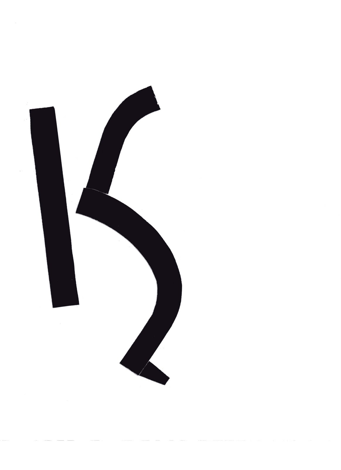
I found that letters could either be really organic or really geometric. I wanted to know if there was a way to make a cohesive alphabet and what if I only used one letter to make 26 instead of 26 to make 26. The letter I chose to do was an s, simply because in the top experiment, I loved the form of it.
I found out that it was really really really hard because there were some letters that needed a straight line, like the stem of the B to be understood. I learned that letters have to have that distinct element to it. From there, I chose a letter that had straight and curved strokes: G.
G's were a bit easier but it was still tough, there wasn't an equal ratio of straight lines to curved lines. Therefore, I chose another letter: D. By the time I thought of doing D's, it was closing in on final crit day and I wanted to put my project in some type of context. I experimented with actually making a word with another word.
I did this on the computer and found that it was much easier to cut out letters and paste them instead of digitally manipulating it. It was faster but there wasn't much moving and shifting of elements. After doing that side track experiment, I went back to D's. This is still an ongoing experiment so I will cover it in the next post after final critique.