Final Presentation
In general, this was a fun project. I felt like I could've taken it further. During final crit, there were suggestions made that I will consider and apply for the presentation with Kathy. I learned that designing an app for a small screen can be challenging in terms of how the users uses it. There's so many rules in terms of what the users can click and size and finger motions and set rules Apple already has. It was interesting to try to work around all of that.
Showing posts with label Information Architecture. Show all posts
Showing posts with label Information Architecture. Show all posts
5.09.2011

5.05.2011
iPhone App Wireframes
Scenario 1, sharing own tip:

Scenario 2, setting alarm:

Scenario 3, viewing and saving tips:

Final, viewing tips:

iPhone App Progress
Round 1:

Flushed 1 design:

Round 2. Backtracked and went with more of nature feel:


4.17.2011
iPhone App Project Brief
My audience is the x-coders. They are really community based and they are on the computer a lot, which leads to poor health care in terms of their backs, eyes, and wrists. My app would allow the user to input their data like weight, height, age, etc. as well as their interests. There will be categories of interest provided to chose from and this part of information would be saved. There would be an option in the app to choose what is wrong and then it generates tips from other users, as well as facts, based on your interests and data and then the user could input their own tips. There is also another option where you can set an alarm to tell you when to take a rest or when to get away from the computer. This alarm could also work to tell you when your "break" is over so you can get back to work if needed.
Icons and Gestures
Gestures
- Screen size is 3.5 inches diagonal with resolution of 480x320 at 163ppi (iPhone 3GS and before) and 960x640 at 326ppi (iPhone 4)
- iPhone supports 8 gestures: tap, drag, flick, swipe, double tap, pinch open, pinch close, touch and hold
- When things are moving on screen, the finger can obscure quite a large amount of the display. Interface might need to be designed to ensure that important information is not obscured.
- Simplify gestures are much as possible.
Icons
- Icons should be perceived effortlessly and represent a broader class of similar concepts.
- There are only 10 standard tab icons like bookmarks, contacts, downloads, etc.
- When creating custom icons, use .png files, white with appropriate alpha and no shadow, anti-aliasing, and 30x30 pixel format.
4.11.2011
Visualized Dreams Final
Final site
I enjoyed this project a lot, mainly the coding part. It was difficult balancing coding with design of things. At first, I wasn't sure what my collection should be and I'm glad I chose to do Disney movies. I feel like I could've experimented more but I like what I did and I feel like it's different.
I enjoyed this project a lot, mainly the coding part. It was difficult balancing coding with design of things. At first, I wasn't sure what my collection should be and I'm glad I chose to do Disney movies. I feel like I could've experimented more but I like what I did and I feel like it's different.
3.21.2011


3.07.2011
Rendering Methods and Designs
Rendering methods:


Image inside of tile, b/w title and when it is rolled over, it becomes color, cropped cover, and b/w cover. I still need to explore more.
Designs:


I left the outlines in there because that will be filled when I figure out which rendering method I will use and so that go in the white spaces. For now, I'm leaning towards the titles with the image inside or some sort of that so that it isn't so busy on the page. I also left it pretty simple so that it doesn't over complicate when I add the image heavy film covers. I do need to make them a bit more playful and colorful and "Disney". I also feel like I could use more graphic elements and I'll maybe add that in later.
2.27.2011
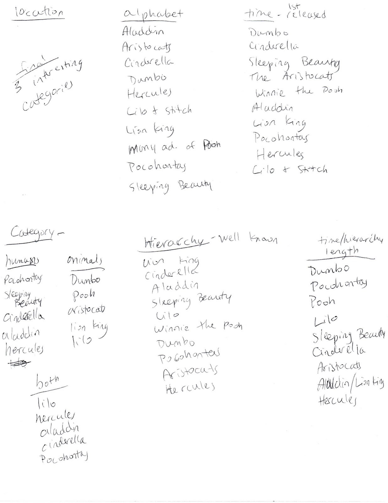
Collection Categories
Process from Friday's class making lists of possible categorization and info graphs


Final categories:
Time released (read left to right)

Main character type:
Animals:
 Humans:

Popularity (in terms of revenue, read left to right)



Final categories:
Time released (read left to right)

Main character type:
Animals:


Popularity (in terms of revenue, read left to right)

Final News Presentation
Scribd presentation
This project was tough for me. I slipped a few times but in general, I was happy with how it turned out. I learned a ton since we've never done website design before. I learned how information can be and should be presented and how to organize it so that people can understand. It was tough juggling all the information and at the same time, making it aesthetically pleasing. I wasn't able to present the final scenarios, which I'm sad about, but I did the best I could. Working in Photoshop also made it tougher since I'm not used to it anymore so relearning that was fun. Overall, there are still a lot of things I feel like I could revisit and improve if I had more time but I'm not unhappy with what I have now.
This project was tough for me. I slipped a few times but in general, I was happy with how it turned out. I learned a ton since we've never done website design before. I learned how information can be and should be presented and how to organize it so that people can understand. It was tough juggling all the information and at the same time, making it aesthetically pleasing. I wasn't able to present the final scenarios, which I'm sad about, but I did the best I could. Working in Photoshop also made it tougher since I'm not used to it anymore so relearning that was fun. Overall, there are still a lot of things I feel like I could revisit and improve if I had more time but I'm not unhappy with what I have now.
Digital Wireframes Round 2 and 3
2.07.2011
Digital Wireframes Round 1
Scenario 1
Scenario 2
Scenario 3
Site map:

Hopefully it's self explanatory. I feel like I'm missing things but I will ask my fellow classmates for their opinions.
Scenario 2
Scenario 3
Site map:

Hopefully it's self explanatory. I feel like I'm missing things but I will ask my fellow classmates for their opinions.
2.03.2011
95% Typography Readings
"95% of the information on the web is written language. It is the information designer's task "to divide up and organize and interpret this mass of printed matter in such a way that the reader will have a good chance of finding what is of interest to him. Information design is not about the use of good typefaces, it is about the use of good typography."
I liked how he stresses that it isn't the type's fault that things look bad, it's the designer's. Typography is tricky when it comes to screen based things and it's up to the designers to know how to use it. I viewed Khoi Vinh's website after we had a talk about him quitting the NY Times and was quite excited to see his website as an example. I loved the simplicity of the website along with the use of its typography.
In the reaction reading, he's basically defending his thoughts about how the designer designs for the users. I totally agree with him because in the end, it's for everyone to benefit from. I liked that he lists all the mistakes different groups of people make when they are in the designing stage. Even though it seems logical and "of course", no one really thinks about it and really consider it.
I liked how he stresses that it isn't the type's fault that things look bad, it's the designer's. Typography is tricky when it comes to screen based things and it's up to the designers to know how to use it. I viewed Khoi Vinh's website after we had a talk about him quitting the NY Times and was quite excited to see his website as an example. I loved the simplicity of the website along with the use of its typography.
In the reaction reading, he's basically defending his thoughts about how the designer designs for the users. I totally agree with him because in the end, it's for everyone to benefit from. I liked that he lists all the mistakes different groups of people make when they are in the designing stage. Even though it seems logical and "of course", no one really thinks about it and really consider it.
2.01.2011
Wireframes Round 1
After researching the USA Today website, we had to create 3 wireframes for our redesigning. The readings helped a lot in terms of what should be there and what shouldn't. Basically it's just a reorganization of data.

 This second one plays off the idea of a map and you basically can click any state, region, or the entire country to view things about that and then it goes into like block things that shows the categories and stories.


This first one, is basically just collapsable things. So if you click on a "tab", that one will open but the others will shrink back. It works throughout the website like the sidebar navigation and the stories.


The 3rd one is kind of like the first idea except there's a reel with all the top stories in it. There's that and then the collapsing thing as well. This is the concept that I'm going forward with so hopefully it will turn out well. It's called the "Collapsable Reel of Stories." :D
Subscribe to:
Posts (Atom)