2.26.2010

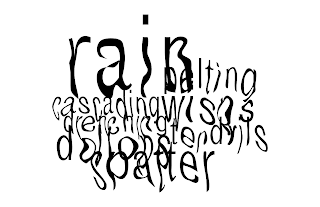
Expressive Type Attempt 2

These were for today based on Monday's critique.


And then I thought we were suppose to start putting them on the bus and the billboard so I attempted to. I don't think they are very successful yet but I kind of have an idea on what I want to do.

Yah...

2.25.2010

Final(?) Icons Reflection

Title: Strolling Surprise
Full icon set at different sizes.
.5" icons:
Linear progression of the bench:
I actually really enjoyed this process even though it was tough at times. I decided to do the linear progression of my bench because that was the one that I had the most trouble with. There was just never quite the right shape or details so I changed it a lot from the beginning. I'm really proud of all my icons truthfully. I think they speak to my style, simplistic yet thoughtful. The ones I can still improve on is the lamp for sure. That one was just a tough one to really depict because there's parts where I can't cut it up or the view isn't right or it isn't cohesive enough, it was just difficult. The hat and the bench were ones that I still had trouble with and I felt like I resolved them but there could be more editing for sure.

Through out this whole icon making process I learned a lot. Iterations, iterations, iterations. Lots and lots of them. I also thought a lot about cohesion of the whole set as well as the individual objects being able to stand on their own and their legibility. I'm quite excited to add colors to these and really see my story come to life.

2.23.2010

Project 3: 7 Deadly Sins

I'm quite excited for this project because we are making a series of photographs depicting the 7 deadly sins or virtues. I decided to stick with sins because they seem more interesting to me. With my idea, I can always switch to the virtues if I wanted. So my idea! I want to portray each sin abstractly using colored paper. Other ideas were to convey it by facial expressions, using only indexes/symbols, and the setting without people.

With the colored paper, I was thinking of cutting/tearing them to convey the sin. So like wrath would be torn paper with sharp edges and more geometric than say, gluttony. I also did some research and there are corresponding colors so I'm going to use those.

Color associated with the sin
  • gluttony - orange
  • lust - blue
  • wrath - red
  • greed - yellow
  • pride - violet
  • sloth - light blue
  • envy - green
With more thinking, I was planning to find objects that associated with the sins in the color that represents it. So like gluttony would be orange candy and greed would be gold jewelry perhaps. Some of them are a bit harder so it's still in the thinking process (or I'll think about it as I go along). They also have associated animals so I could probably find a miniature of them and spray paint them. I did say above that I could do this for virtues as well so I might as well add those colors just in case.

Colors associated with the virtue
  • humility - purple
  • kindness - pink
  • compassion - blue
  • diligence - green
  • charity - yellow
  • patience - orange
  • purity - white
Yah...I really don't want to stick an object in but I also want for people to get that sin right when they look at it. Maybe the paper needs to do magic then.

Icon Set v.2

Revised icons according to critique last Wednesday and an upperclassman (Mo).


I think the bench is it this time. It's more organic like the others? The only one I'm unsure about right now is the hat. There has been altering since my drawing of it and hopefully it reads hat better. Oh welps.

2.22.2010

7 Deadly Sin Wine Glasses

Stumbled on this quite a while back. Made by Kacper Hamilton.


I love how creative these are and how the artist decided to depict the deadly sins. This definitely acts as an inspiration on how to depict "nondepictable" things.

2.21.2010

Expressive Type Attempt 1

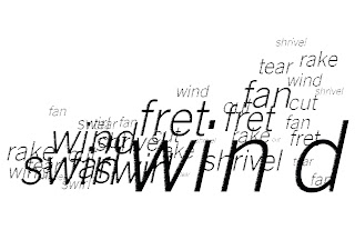
These are for Monday, where we aim to create a cohesive set of expressive weather. I aimed at bringing the characteristic of the weather into the composition. So like dawn is in more of a horizon shape and its font is lighter. Rain seems wet (not as good as the scan in my opinion but it was worth a try right?). Thunder is stronger and more "in your face". And wind has a sweeping motion.


I tried 2 versions for wind, just to mess with the type and filters. I'm starting to like the one where it was blurry but maybe it's too much? I was thinking that I could possible print these out, warp the paper some how so that it reinforces the weather and then take pictures/scan them. But for now, I'm going to stick with digital and see where that takes me. :D

Project 2: Expressive Type

So we started our 2nd project Friday and we had to bring in experiments of our expressive type. We were suppose to choose 4 types of weather and represent them expressively but they were suppose to kind of make a story. Therefore, I chose dawn, rain, wind, and thunder. Below are several of my experiments for last Friday. I did a lot of scanner work because I liked how it looked but also did digital setting of type (which is something I'm leaning towards).
Dawn didn't really work out....>.>
I really like rain and how it came out. Making it in digital type didn't work as well so maybe I'll stick with the scanner this time.
I didn't show the crumbled one in class because the word thunder wasn't dominate enough, but I like the idea.

Yup yup. I like where wind is going so I'm going to push that a little bit more.

2.19.2010

Generate and Cull

I loved how this article started because I do the same thing too (with comparing things). The article as a whole emphasize iterations, iterations, iterations. I liked the sentence, "The best choice isn't always an obvious decision" because that's where iterations come in play and the more you produce, the more you can choose from. In prospective to where we are with our icon set making, iterations are really important. I've done so many iterations for, lets say, the bench. In my previous matrices, you can see how they all differ and which shape works better than which one. A lot of my icons also were not what I had in mind in the first place and that's where the "thinking while making" phrase comes in because I've changed things around or take out/put in things that were/weren't originally there. The list on the bottom was helpful too since it listed many reasons why generating and culling is good. I also like there there is 2 number six's to end the list.

Icon Set v.1

Here's my icon set so far. My direction is to use gaps, which is good because that was the one I was leaning towards anyways. In my previous round, on my converse, I had this like pinched ending at just one spot (pictured below) that I really likes so I tried to incorporate that cinch in all of them.

Vectored icons at 3...4".

1" in a row.
So far, the most challenging one seems to the bench. I stopped with that curving thing at the seating area and went more geometric. I'm starting to wonder if it's too geometric for the others or not. The lamp post and the scarf is still analog since those are the ones I just added. The lamp post sees off a bit because it's more straight on rather than at an angle like the others. That and the scarf seems too simple? I don't know. But so far I'm really liking it.

2.18.2010

Final Change 1 Thing

It's done! Below is actually my revisions for last Monday.
And here's the one I actually submitted as my final poster.
I learned a lot from this project. It was a good practice in poster design and I need think about how to convey a message visually. This was a hard fact to depict because there is so much information and to arrange in a way that made sense but not overpowering was hard to balance. I'm satisfied with the end result since it definitely has improved from my first ideas.

2.16.2010

Final Constructed Poe


This project was such a fun project and I learned so much from it. I think my overall compositions improved and my lighting effects. Below are the ones I liked that I took over the weekend.

When we got studio time, I talked to Tyler and he pointed out things that was "wrong" with them (to which I agreed with) so I took some more photos during class and came up with these.
Before saturation ^^. Just to show the general color I was working with before fixing it. Most of my photos came out with more of yellow light.After saturation^^.

The horizontal and the vertical are essentially the same composition but with different framing. I think they are a definite improving to all my last ones. I took so many photos but so few worked out. Which I guess is good because it was hard choosing just one. The very last picture, the vertical one, is the one I chose to print big for the final critique. Personally, I love it more than the horizontal one but they are both good. So I went around and asked people and they were torn as well but after hearing some good reason, I feel good about the vertical one.

Matrix 3

Third matrix made. This time, the variables were limited down to 5 rather than...13? Which was so much better because some of them were not working at all. So first off, just some scans of my drawings.


And then my most current matrix. I'm really loving the close vs. gap relationship and the repeated element. I was told to try straight on views of the objects and I'm not loving it as much. But I think they are a definite improvement to my last matrices. Hopefully....>.>

2.14.2010

F+S


Vancouver 2010 Winter Olympics pictograms!

I actually really like these. They have a more modern feel to them and they are easier to understand. I like how there's a repeating element to all of them, the "reflections". The olympic emblem above is awesome as well. I got it from here and I like how they showed their inspiration and how it translated into an icon.