Showing posts with label T4: Project 2. Show all posts

5.04.2011

Type D

So for final crit, I printed out some Helvetica D's and passed them out. The rules were to make an assigned letter, using the least amount of cuts possible with the max being 7, and somewhere in the made letterform, have a gap between strokes. These are what I got back:


I also made my own set of alphabet with just the D and the same rules.


During final crit, I will also ask my fellow classmates to do the same. Therefore, I will have 3 different sets of some letters. Hopefully this will work. I will post those after they are done. 

Edit: Made during crit


Experimental Type Progress pt.2

creating new letters. show wat ppl did and wat i did and s's

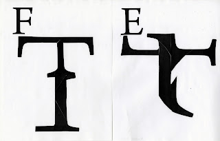
Somehow, my "spacial interaction" idea turned into just interaction with letterforms. At first I handed out different letters to everyone asking them to make whatever letter they desired as long as they cut the given letter up five or less times.

 I got back a lot of F's along with other letters.


T's, R's, and E's were also popular. From there, I wondered if each letter could be used to make another letter without repeat. Also, what if it was sans serif instead of serif? This time, I did this personally as to not bother other people.

I found that letters could either be really organic or really geometric. I wanted to know if there was a way to make a cohesive alphabet and what if I only used one letter to make 26 instead of 26 to make 26. The letter I chose to do was an s, simply because in the top experiment, I loved the form of it.
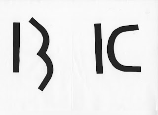
I found out that it was really really really hard because there were some letters that needed a straight line, like the stem of the B to be understood. I learned that letters have to have that distinct element to it. From there, I chose a letter that had straight and curved strokes: G.
G's were a bit easier but it was still tough, there wasn't an equal ratio of straight lines to curved lines. Therefore, I chose another letter: D. By the time I thought of doing D's, it was closing in on final crit day and I wanted to put my project in some type of context. I experimented with actually making a word with another word.
I did this on the computer and found that it was much easier to cut out letters and paste them instead of digitally manipulating it. It was faster but there wasn't much moving and shifting of elements. After doing that side track experiment, I went back to D's. This is still an ongoing experiment so I will cover it in the next post after final critique.

4.26.2011

Recent Type Example

So I've been working on making letters from another letter. Through this experimentation, I've learned really specific elements make up one letter and these elements make that letter distinguishable. B's have to have a straight stem and the 2 bowls have to be distinct. I's have to be straight and if it looks at all curve, it might look like a J. V's have to have that tip at the baseline or else it will look like an U. The list could go on and on. When making an alphabet, there has to be some sort of indication to make it cohesive either through how many cuts I make or the rules I set up for myself. These rules are meant to keep things together and challenge me. I will then take these rules and apply it to the user's interaction.

4.05.2011

Experimental Type Progress


 So far, I have learned that type can take any shape and form. The form of it can be very intricate like calligraphy or it can be a mess, barely recognizable. With my experiments, I want the users to be able to create their own letter forms and then I take those and manipulate them somehow. Or I can just let them make their own. The top image went for that idea with me providing certain parts and then allowing the users to create a letter from those parts.
I also looked at scripting in Illustrator and how they can manipulate a letterform. Above is a script I found and it made me realize that no matter how much you want to push this script, the letter form is somehow still visible. Which made me wonder, how much can I push legibility before a letterform is no longer a recognizable. Can people even see the letter without knowing it was a letter in the first place or will they see something completely different. Type can act in many different ways. I think the way I'm approaching it shows that there is a very thin boundary of legibility.

3.29.2011

Experimental Type Images

Some type experiments I found that is part of the type wall:


After that exercise, we chose an area of interest that we want to explore more of. I chose to do interactive work and found some really cool websites: Typeface ProjectType is ArtTyporganismBembo's Zoo

I was also interested in spatial type so I looked up some of that as well: XYZ Spatial TypeFoam Letters3d Typography Book

When we were sharing in class of our areas, I thought, why not do spatial interaction? So that ended up being where I'm geared towards but I'm still very interested in being digitally interactive so hopefully my end product can be something translated into the computer. Also in last class, we had to come up with a tiny experiment to sum up our ideas and I did something really simple. I just made a ton of cubes and let the audience make letterforms out of it.