More iterations of the two concepts I continued on with. First, will be my logos. So here are round 1 iterations:


From this round, the middle bottom works the best because of the transparency and the image as background. I kept with that one and continued on with another round. This time, I focused on making the molecule less scientific and more artistic since I had the structure down already.
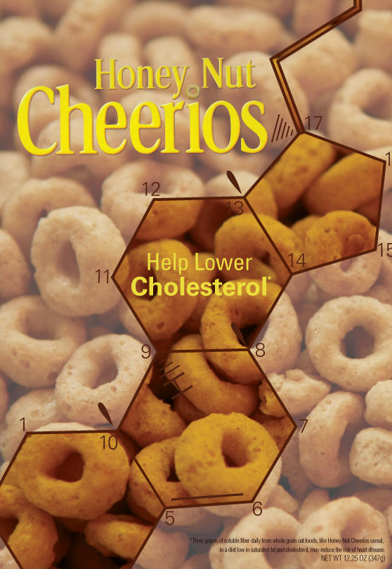


These are more subtle changes but there are bits and pieces that I pulled from each for the final. The weight change in the molecule looked a lot better than when it was one weight or when it was bubble looking. The details in the molecule looked best with the circles so I took that and applied it to all the detail lines. The font for the numbers weren't working yet so I changed it for the final. Next are my pathos with the swinging girl. While I was working on that, I wasn't really loving it so I reverted back to the Cheerio as the sun since people were talking about it in class so I thought I could at least try it.


I tried the drawing techniques with multiple drawing tools and mixing them here and there. It was decided that I went with the sun concept and honestly, I like it a lot better than the swing. There wasn't much to change in terms of elements, it was just rearranging them here and there. So that's mainly what I did in the last round.


The very last one has a very light blue tint to it but it looked better in just white. So that's that.
No comments:
Post a Comment