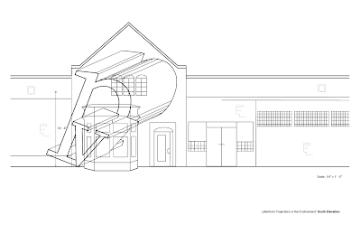
So this week we finished our drawings in Illustrator with our initials. At the end of the week, we compiled all of them to make a booklet. This was my cover:

Yup. I worked on the building lines with Amber and I did the front side (LOTS of lines). After this project, I definitely learned A LOT. I got the hang of Illustrator more and I know how to do masking now (!!!). When doing the obliques, it's critical to be selective (which was hard for me, especially with the curve of the p). Line weight was also super important since things that were closer to us, were suppose to be darker/thicker, and lines that we can't see are dashed. I think this whole project relied on the "less is more" phrase since you want the viewers to understand it without overdoing everything. Therefore, being as minimal and simple as you can be is great. Overall, I'm enjoyed this project but I'm so done with it. Next week, we are going to be building letterforms, which I'm worried about but I think it will be fun.


No comments:
Post a Comment