9.27.2009

Booklet

So this week we finished our drawings in Illustrator with our initials. At the end of the week, we compiled all of them to make a booklet. This was my cover:


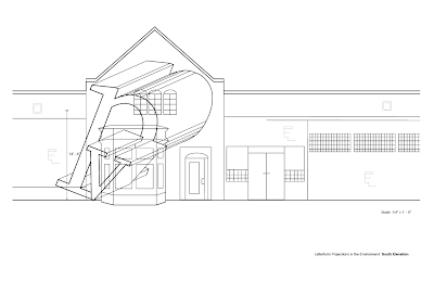
As I was looking at it right before I turned it in, I realized I forgot to delete like 3 lines. >.> Oh well. After the cover were pages that I posted last week, but with alterations (not that many so I won't repost them). What I didn't show last week though, was my elevation of the Design building. So the next two images are of the south (front) and east (side) side. We needed to put our environmental letterforms on them.


Yup. I worked on the building lines with Amber and I did the front side (LOTS of lines). After this project, I definitely learned A LOT. I got the hang of Illustrator more and I know how to do masking now (!!!). When doing the obliques, it's critical to be selective (which was hard for me, especially with the curve of the p). Line weight was also super important since things that were closer to us, were suppose to be darker/thicker, and lines that we can't see are dashed. I think this whole project relied on the "less is more" phrase since you want the viewers to understand it without overdoing everything. Therefore, being as minimal and simple as you can be is great. Overall, I'm enjoyed this project but I'm so done with it. Next week, we are going to be building letterforms, which I'm worried about but I think it will be fun.

9.24.2009

K's

So I decided to do K's (which Michael didn't seem too happy about >.>) and here are some of my words that I have chosen.

kangaroo
kite
kiss
kid
knight
king
kiwi
kickball
keyboard
knit
knife
key
koala
knee
knot
kidney
kennel
kaleidoscope (I'm totally going to do this one...I just have to find a pair with it)
kettle
kitchen
kitten
kit
knob
kanji
kelp
kiln

Yup. I really really really want to do kaleidoscope, so as for pairs, I'm thinking that with kite. Otherwise, knight and king works as well. Or kennel and kiln. This is still in the process of thinking. So more words and/or pairs might come later. Maybe even some images.

9.20.2009

Obliques

So this last week we made obliques with out initials using the pen tool in Illustrator. So here's my initials:
After that we made orthographic views of the letters and then elevation obliques and plan obliques. The following pictures aren't correct (I'm still in the process of correcting these).


Yup. Next week we are going to make a booklet out of all these (which I think will be super cool) and then something else. At first, it was hard grasping where lines would go and connect the letters but it takes effort and I think I'm getting it slowly. We also drew out the Design Building, which was fun. I felt like I did too much work though. I will post the picture next weekend when I'm done with everything. Yup. I'm sort of done doing obliques and whatnot. It's fun but it's getting tiring. >.>

Final Statement

So the whole dot process was pretty stressful. I started off with the theme of "family" and I wanted to do something that defined what family is to different people. I use the term family loosely because I consider my closest friends as family, and I would like to believe that others think like this as well. From there, I chose 9 words to describe family, 5 good and 4 bad. I set up my book every other page, starting with a good, followed by a bad, etc. I felt like this way, the viewers can see that everything good comes with a bad, and vice versa. I chose to stick with colors and textures since these words were very open and there wasn't just one thing that can explain the meanings. So with the colors, I chose colors that went along with the feelings they convey. For example, I used red with fury because red conveys excitement and energy and yellow for neglect because it conveys betrayal and deceit. As for the textures, it was based on the word itself, like what is support. It could be anything really, from trees to metal to rocks and so forth. So that was how I approached textures and colors. In general, I think the book flows well. The last page is impenetrable, which I chose gray as the color. It seems like a really dull color since all the other were bright colors, but gray means security and reliability and I thought that was really deep for family and a good note to end with.

I definitely learned a lot during this whole project. I learned how to convey a word clearly using just dots. Which was hard, especially for "intact". You wouldn't think it was hard, but it was my toughest word probably. As for type, I really like having to print, cut, and paste each word/letter. It was way easier than if I was to do it in a program. And plus, I got to learn how to use the Konica. Craft wise, I could definitely improve. I got some circle cutters but for the circles that I had to cut by hand, they look so bad. And my pages aren't even. Yes. There's still a lot to learn and this was a good 1st project to start with.

Reading Response Transparency

The readings from Lupton's book along with the lecture was an eye opener. I have always realized that layering and transparency can help make a piece wonderful, but not in a sense that it can create new meanings. In our book project, we made different compositions out of dots for Vis Comm and then different compositions of type in Type. When put together, they enhance the meaning of the word exponentially. I feel like it's easier to understand the word and it gives it more meaning than the dictionary. At the same time, they might seem like they wouldn't work together at all but together, they convey the message well. Overall though, it makes the book cohesive and it flows from one page to another.

9.11.2009

ORTHOgraphics!

So this week (and last) we drew lines and made orthographic views of things. >.> These were done in Illustrator but I do have a drawn set as well (it's not as good).

Yup. Um... we also worked on pen tooling our initials. And mine needs to be fixed so I'm not going to post them today. The pen tool is really hard when you are outlining your initials that have curves, like p. So next week we are going to do several views of out letters, like make it 3d looking and whatnot so that will be fun. I feel like I will have no troubles once I get my p done but who knows.

9.08.2009

Project 1 Reading Response

The reading assigned related to our project very much, and they were helpful. They all worked together to help me understand what is needed to convey a message. In Meggs' reading, it emphasizes how the bleeding or cropping can help convey a message or how using angle and the viewpoint can change or help the meaning. Wong's reading talked mostly about contrast in everything. The one I found most useful was the contrast in size and how it can show dominance. Dondis was the most helpful reading. It talked about what makes design appealing by using opposing pairs, how one cannot exist without the other. For example: balance and instability, unity and fragmentation, predictability and spontaneity. I loved how they used words that we needed to depict in the warm up exercise. In general, I feel like I've learned very important aspects of design.

9.03.2009

Final Words

My title for this book is going to be somewhere along the line of "Good and Bad Characteristics of 'Family'." Except maybe something different. That's where I'm headed though, and it's a good start I think. So I'm splitting my words into 2 different groups. The good characters are going to be dependable or support, reverence, adoration, reliance, and impenetrable. I'm debating between dependable, support, and reliance since they seem to be the same idea. So I'm thinking of using one of those 3 and then intact perhaps? And then for my bad characteristics, it's going to be fury, hostile, suppress, and sorrow perhaps. I'm pretty positive with most of them, but some are still iffy. Maybe once I start thumbnails, it will come. So any comments or input would be awesome right now.

Overdue W's

I am so behind with my blogging for Type I, so here's a crash view of the first 2 projects. At first, we were given a letter in 5 different fonts and we had to enlarge them onto butcher paper. The following 2 pictures are of my 3 w's.


My favorite one out of all of these would probably be the 2nd one, with the black w on painted outlines of the same font. It was originally something else that was super boring (it was actually my first one), but when I made my charcoal one, the first idea seemed really dull. So I cut up the first one and created that one, which I really like. The following 2 pictures are, I guess, Project 1 redefined. We had to create 2 more drawings but with the anatomy of the letter on it.


I actually really like both of them. The first one, I was just drawing without measuring so there were a lot of lines and I liked the look so I just traced them. The second one isn't so bad either, but I wished I had written on the labels instead of pasting them on. I was going to do it with charcoal as well but I couldn't figure out a way that I would like. Guess I should've thought harder. >.>

Project 1 - Line Drawing

So this week we started with drawing lines on paper and then did orthographic views of 3d objects. Surprisingly, this was the one class I wasn't sure if I would enjoy, but so far, so good. I'm really liking the whole perfection and line drawing aspects. After that, we moved into the pen tool on Illustrator. Oh, my, gosh...the pen tool. Before, I HATED using the pen tool on Illustrator, it was just too complicated for me. (I liked using the Photoshop one better.) After Terri's demo, I finally got how it works and it's amazing. I would upload the lines I made, but I have yet to figure out how to make it work. >.> Maybe I'll also add my drawings when they are okayed along with the pen tool exercises.

9.01.2009

Theme and words

The umbrella topic that I chose was family. I wanted to find out what the term "family" meant to people. For many, it might mean the closest friends they have, or their actual family. Below is the list of words that I have compiled. Many might mean the same, but their impact individually is different to me.

accommodating
dependable
endless
fury
support
animosity
grand
reverence
adoration
snug
reliance
comfort
reinforce
excite
justified
impenetrable
dynamic
intact
strengthen
infinite
stimulating
embolden

Were there any other words that you feel would go well under this list? Feel free to add a comment.