Mass post! Below are some from round 3 of the museum exhibit of the opposite attracts. I changed it to "Deception: The Price We Pay for Our Wants".


Round 4. These were presented at final crit. VERY BAD. It was actually okay but the texture wasn't working. Just a selected few.

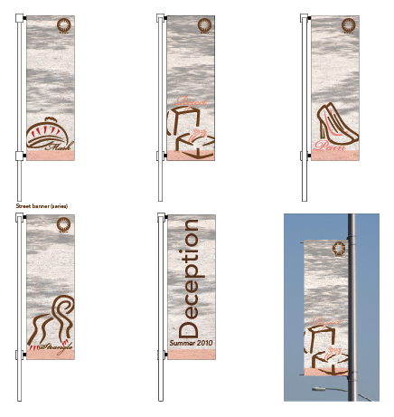


And these are my final ones for final review. The texture is changed making it more legible and hopefully there's more variety to them. Much better I think.


There's still a lot I can learn. I tend to be really systematic and never really thinking about how to make it look pretty. That's something I will work hard to improve on.
Not all design has to be (or should be) "pretty" all the time, but certainly you need to strive for your work to be visually engaging, eye-catching, formally innovative, admired, and when appropriate, even beautiful. Over the summer LOOK at design and designers (in magazines, books, online) and start classifying the myriad of aesthetic approaches that you think fall into these (and more) categories.
ReplyDelete